


CVS PHARMACY APP DESIGN
This design study focuses on the user's (Dean) consumer behavior with deals and rewards offered via the CVS Pharmacy app. The following are some observations and discovery, along with improved interactions to enhance the UX.
Scenario
Dean has chosen to opt-in to receiving CVS's marketing communications. As a busy parent with toddlers, he visits the local CVS Pharmacy once or twice a week to purchase a variety of products from cough drops to diapers. He wants a satisfying in-app/in-store experience and uses the app to take advantage of current digital coupons and sends these “deals” to his ExtraCare card – to him this is the most valuable customer incentive.

SCREENS CONSIDERED
For Dean, the in-store deals are the most useful benefit as a card member/consumer at CVS. The app enables the use of digital coupons and helps him save time while avoiding the inconvenience of printed coupons. The current CVS Pharmacy app has the fundamental features and functions that he needs as a consumer. The purpose of the following screens is to illustrate potential improvements that could help identify deals more efficiently.
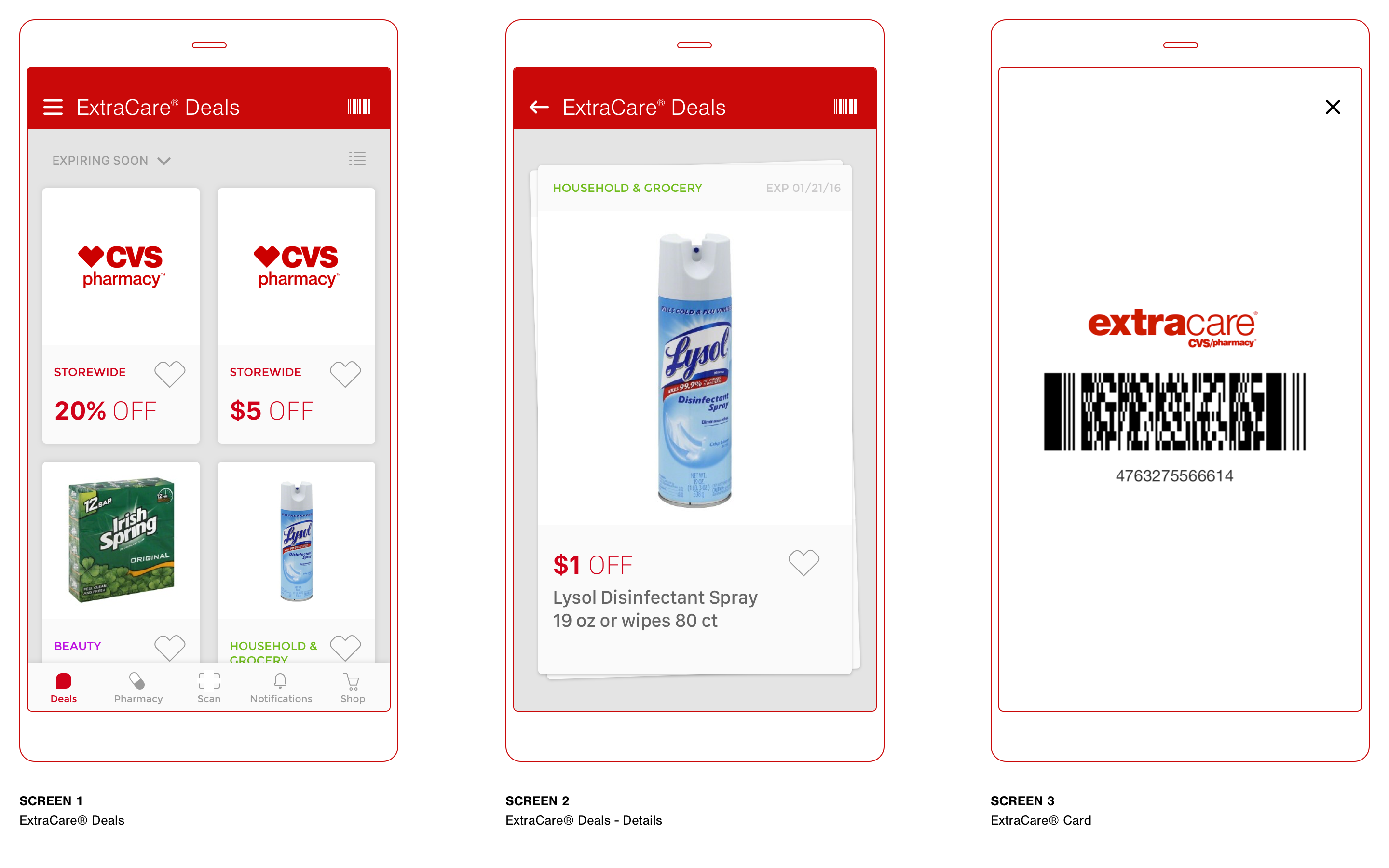
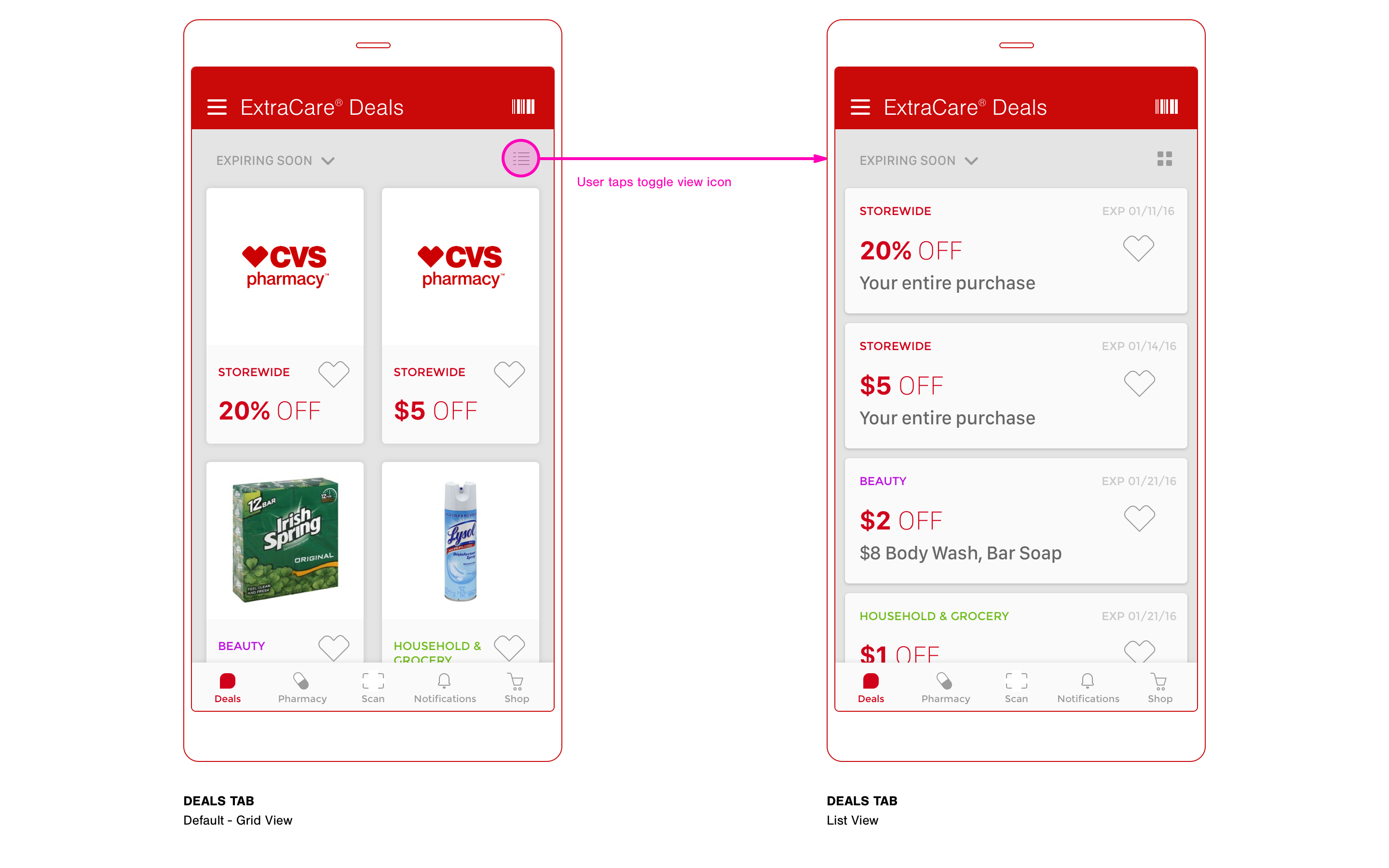
DEALS TAB
This would be the first tab selected by default when opening the app. I felt it necessary to simplify the navigation by eliminating the notion of a home screen. The layout reflects a tiled card UI pattern and presents immediate visual interest, while clearly showing each deal in a predictive scrollable fashion. There is a toggle view icon to switch between grid and list views.
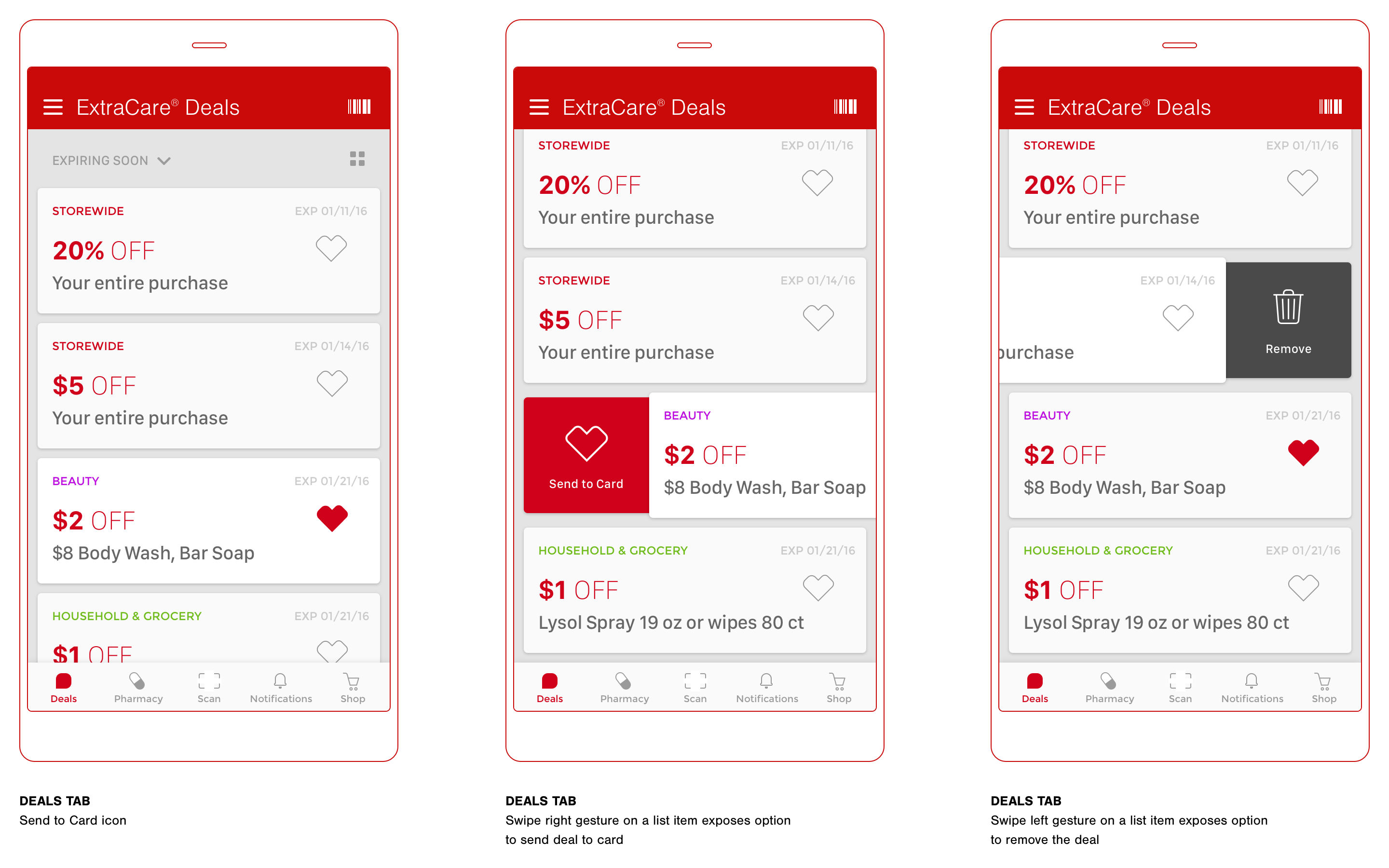
DEALS TAB (continued)
The following screens show a couple of different ways to send a deal to your ExtraCare® card. Tapping the CVS heart icon would instantly send the deal to card. The user (Dean) can also swipe right to send to card, or swipe left to remove from the list. This enables a quick way to select the desired deals.
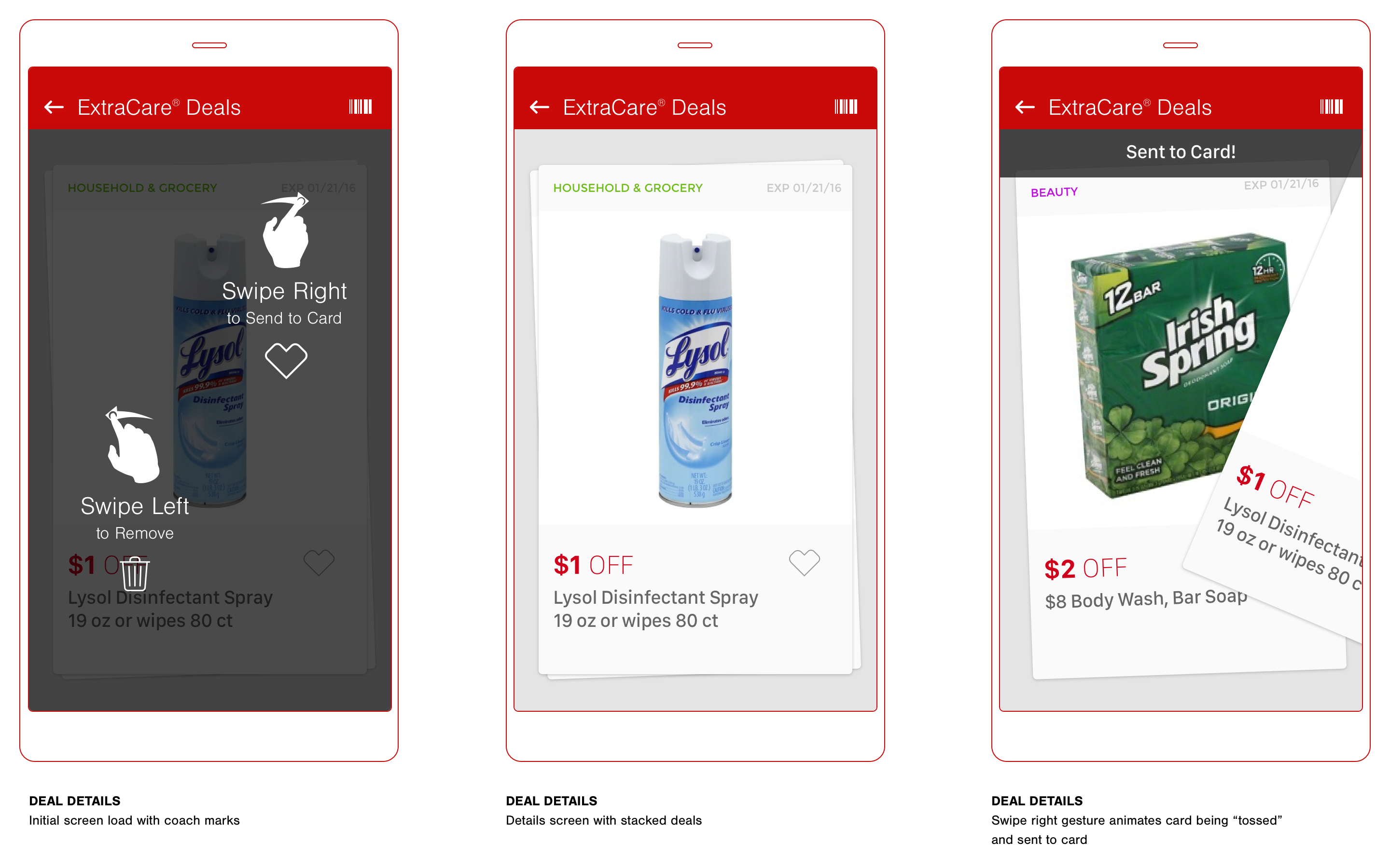
DEAL DETAILS
The details screen appears once a user (Dean) taps on a singular deal either from grid or list view. Coach marks are presented only on initial load of this particular screen. The user (Dean) can swipe right to send the deal to card or swipe left to remove. The “tossing” of the UI card via the swiping gesture presents a fun animation to enhance the user experience.
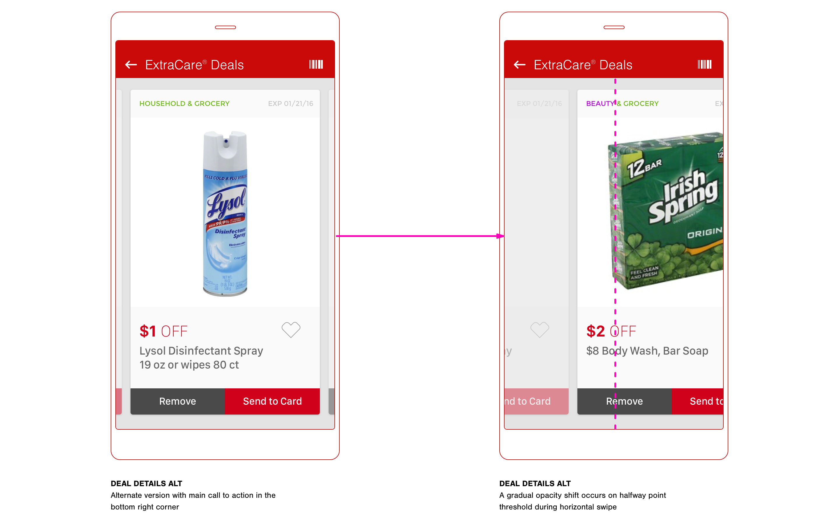
DEAL DETAILS ALT
The following screens show an alternate version of the deal details. This example also reflects a simple left or right swipe, but the interaction represents a horizontal scroll through each deal rather than the gesture dictating an action.
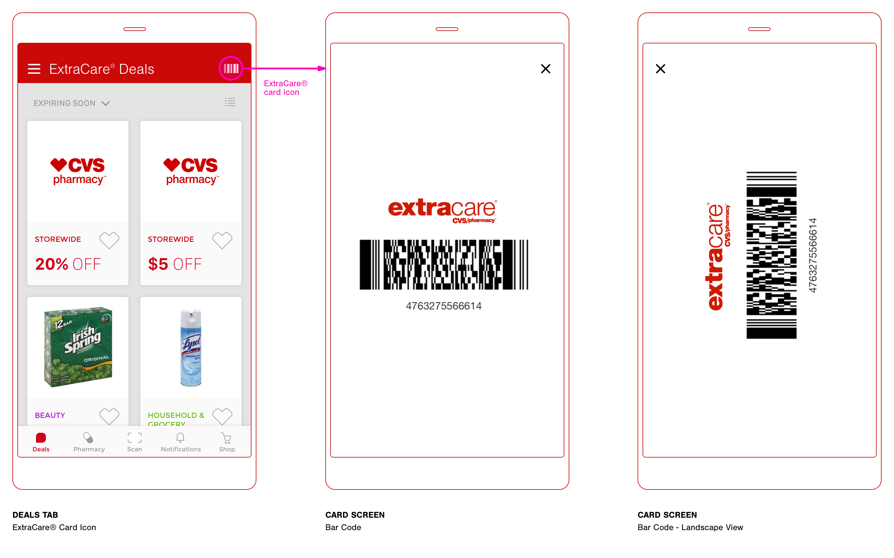
EXTRACARE® CARD
This screen is possibly the most important as it eliminates the need to present the key chain card during checkout at the store. Dean often find himself fumbling through his keys when giving the card to the cashier for scanning. Access to this screen would be ever-present throughout the app.
Third-Degree
Price Discrimination
Interesting discoveries usually occur through further product design thinking and observation. The user (Dean) and his consumer behavior with digital coupons in the context of this design study go beyond his interactions with a mobile app. There is a direct economic strategy that is applied to influence his buying habits. The concept in this case is called "Third-Degree Price Discrimination".
Dean is a customer with a very elastic demand — he is a consumer who is very responsive to price changes. Even with his busy lifestyle, he is likely to take time to find coupons that effectively lower the good’s price.