


Context
Auction.com offers over 30,000 discounted residential bank-owned and foreclosure home deals. Its platform supports a high volume of properties and boasts an extensive digital ecosystem to connect the buyer and seller. Yet, the homepage struggled to represent the company as the nation's leading online real estate marketplace. It left the user to their own devices, providing zero guidance or logic as to how the product was being merchandised. I facilitated a journey-mapping workshop and a 4-day design sprint to re-envision the homepage that would help potential buyers discover the right property.
THE PROBLEM
A quarter of Auction.com's daily traffic lands on the homepage which currently doesn't offer much value to user. The logged-out (not registered) experience ineffectively communicates who, what, and why. The homepage also lacks proper merchandising for the various property types that can be presented in a clear and distinctive way. The logged-in (registered) experience misses the opportunity to render personalized content based on the user's needs and preferences.
GOALS
1. Conduct expert interviews from multiple departments to identify a long-term goal and sprint questions.
2. Produce concepts based on various mapping and sketching exercises.
3. Prototype a singular concept that best captured the essence of the long-term goal for the sprint.
4. Test and validate the prototype.
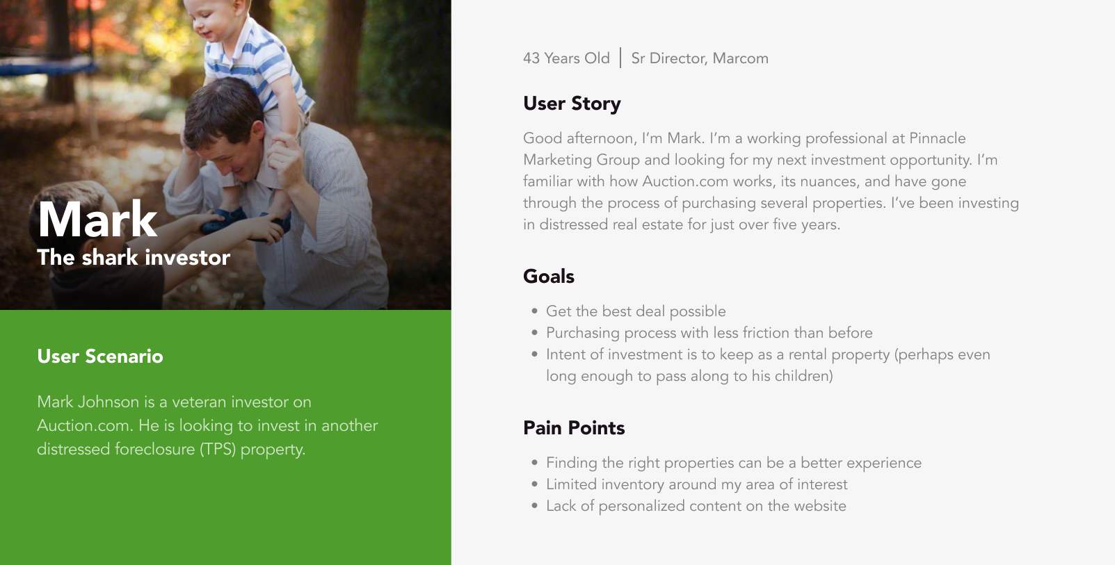
PERSONA
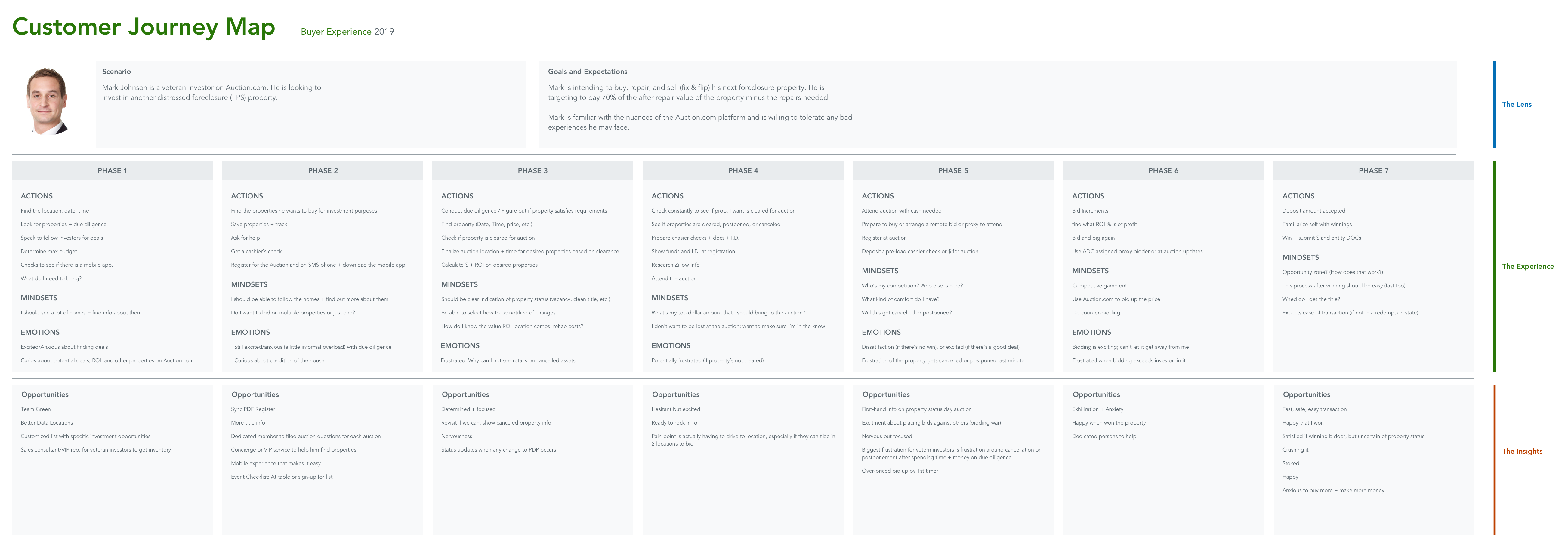
Based on qualitative research data, it was an easy decision to focus the customer journey mapping exercise on the "shark" investor. This user archetype represented a large portion of registered accounts and helped narrow our focus during the workshop, described below. We also leveraged workshop participants to represent the unregistered user we deemed as the "newbie" investor. These were people who had little to no experience bidding on distressed real estate properties, let alone purchasing them.
PREPARATION
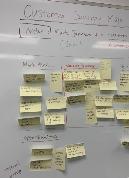
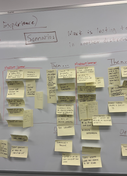
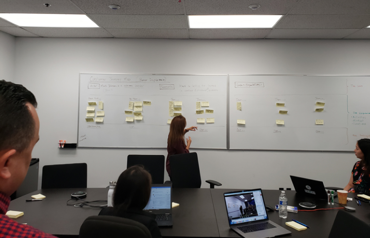
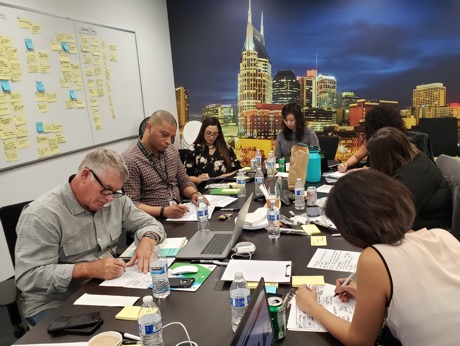
Before diving into my role and the design sprint details, there was prepatory work needed to be done weeks prior to help better understand the user and their needs. I organized and conducted an internal workshop to understand the customer journey. This workshop included members from various departments, similar to the blend of participants involved in the design sprint. With a collective mindset, we leveraged information from existing research and insight to map out the customer journey.
MY ROLE
Leaning further into the role of a service designer, I faciliated the design sprint to help create and test a prototype of the homepage in 4 days.
PROCESS
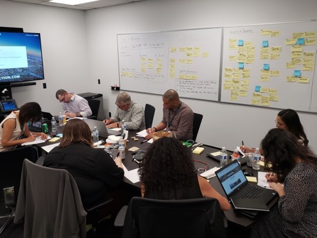
We gathered key stakeholders, including executive-level partners, from Marketing, Product, UX, and Asset Management. The first two days of the design sprint were most critical as it required a high level of input and engagement from the participants.
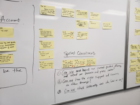
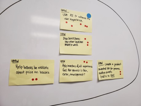
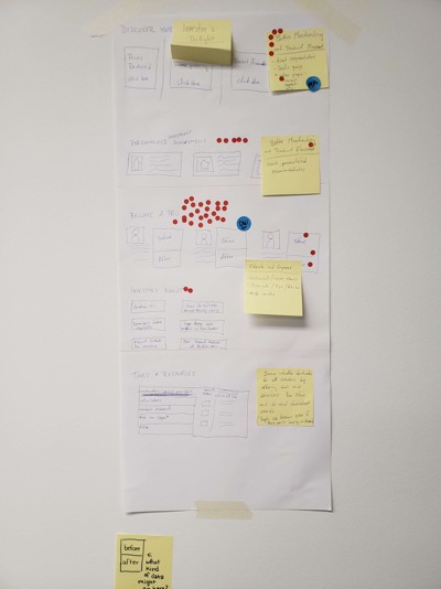
Day 1: We kicked off the design sprint with optimistic conversation starters by asking several "How Might We's" (HMWs). Then we put on our pessimist hat and asked questions prefaced with "Can we...”, which alluded to potential constraints we would face internally on road to launching the redesign. As the day progressed, we ideated through various exercises and asked each participant to sketch their solution for the new homepage.
Day 2: The focus for this day was on critiquing, voting, and deciding on the concepts (both logged-out and logged-in) that best resonated with the participants and aligned with the long-term goal. Various portions from multiple concepts were pulled together, which led to a card sorting exercise to determine the hierarchy of the content.
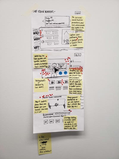
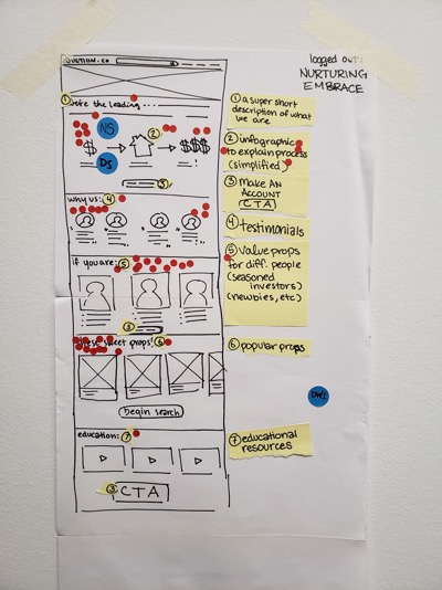
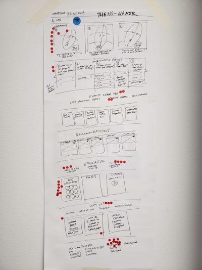
Day 3: Prototyping the concepts: logged-out and logged-in homepages.
Day 4: Both concepts were tested via Usertesting.com. The Product Designer, UX Researcher, and Content Writer collaborated and wrote the usability testing scenario. The test for the logged-out concept was conducted on users who had never heard of Auction.com, while the test for the logged-in concept was performed on those who had previously used Auction.com.
SOLUTION
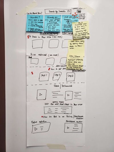
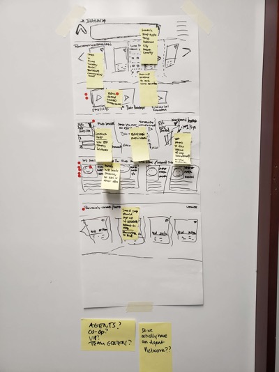
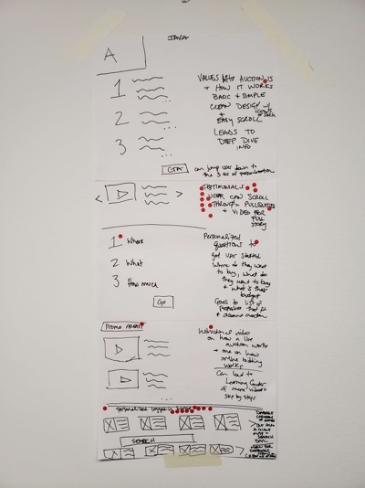
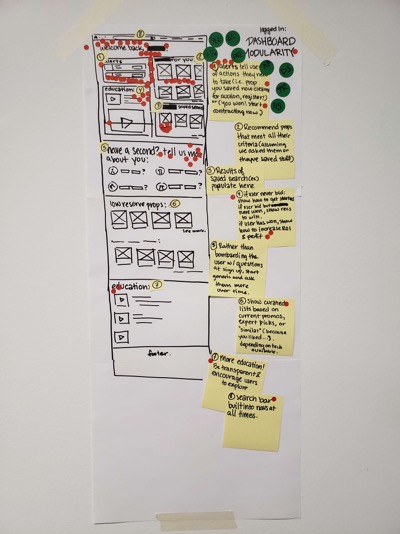
With the long-term goal in mind, several concepts for both logged-in and logged-out homepages were sketched out on paper with sticky notes to annotate thoughts and further explain details as needed.
OUTCOME
There have been some interesting feedback patterns from initial sessions of usability testing. It wasn't quite clear to several users observing the logged-in homepage that the service was free. There was also ambiguity between searching before the need to register for an account. Although we have produced prototypes for both versions of the homepage, it is still to be determined whether the project will move forward for 2020.
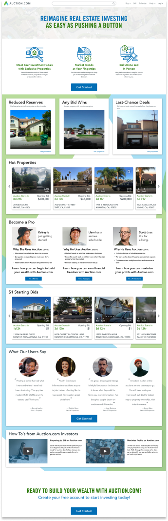
Logged-out
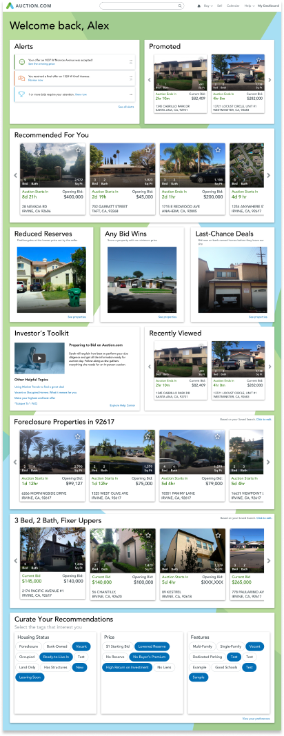
Logged-in